Mi CAMPO L!VE LOUDER
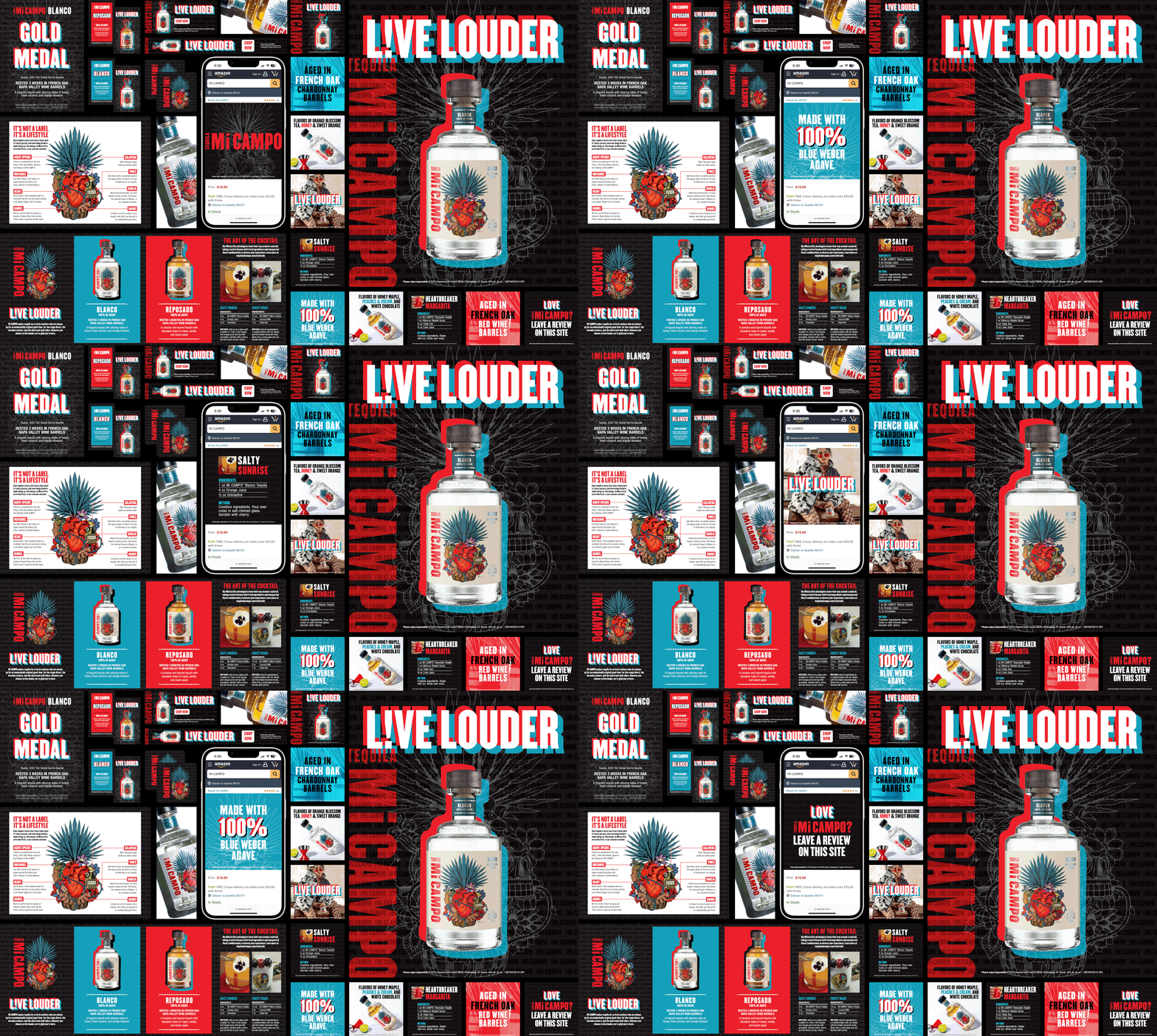
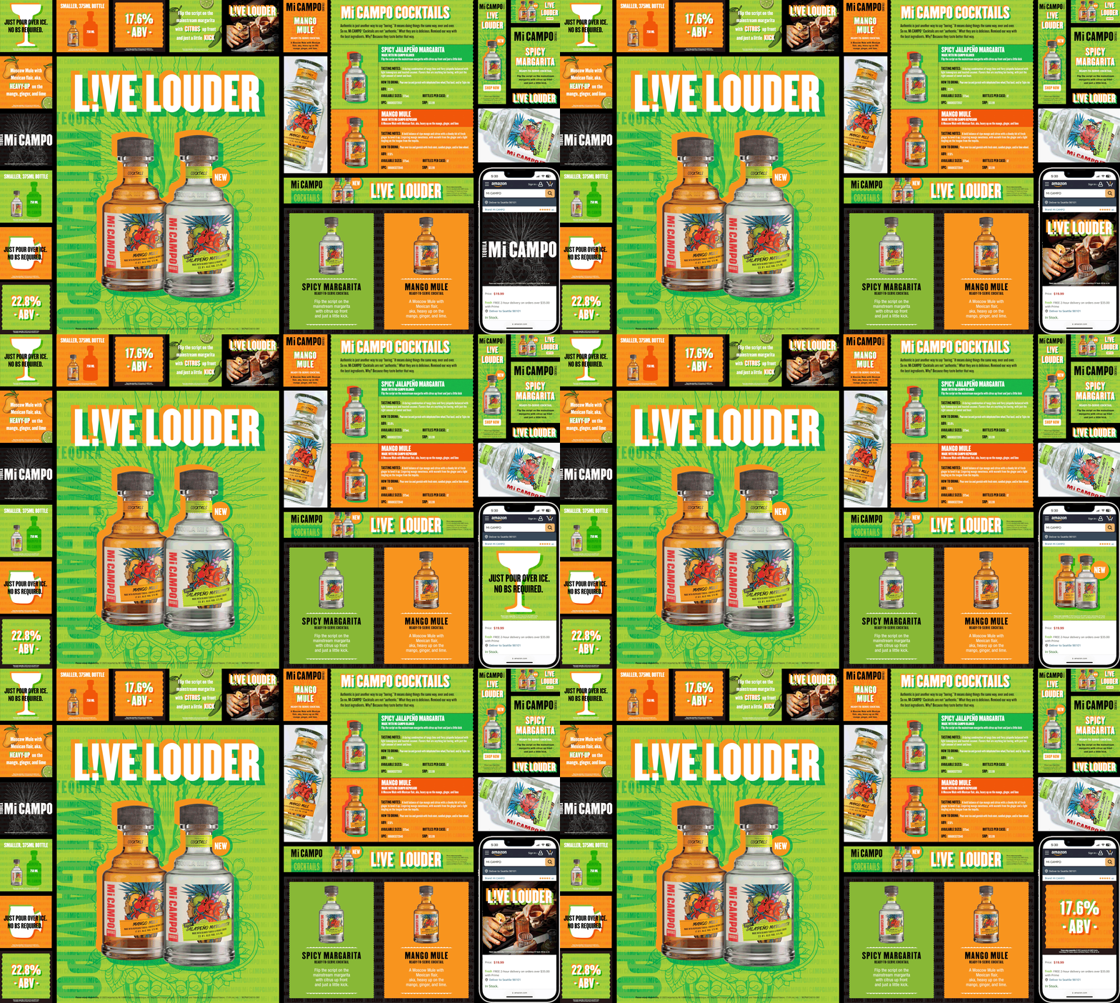
Mi Campo was looking to reposition its essence towards the edgy, rebellious, vibe like that of its Gen-Z target consumer. Moving away from the traditional tequila space—leaning heavily on authentic Mexican culture and the tequila-making process—Mi Campo felt inclined to L!VE LOUDER. So when it came to redesigning their look/feel, I wanted the creative to live just as loud as their message. Taking inspiration from the early 2000s (that happens to be so on trend) in texture, typography, and color palette, I designed two key visuals for their Core and Ready-to-Serve tiers. I admit it was a challenge to maintain hierarchy when it was vital for branding, product, and message to all be hero; but with dynamic movement and graphic orientation, the layout feels harmonious…and loud.
(These key visuals were then rolled out to the entire Mi Campo marketing platforms including retail, on-premise,
Live Nation Concert activations, print and digital advertising, ECommerce, etc.)


